All projects

CASE STUDY

Nobis Bank

A redesign of the fintech product I've worked on for the last 4+ years: a mobile and web banking app for small and mid-sized businesses.

  • Mobile app
  • Web app
  • Fintech
  • B2B
  • B2C
  • Redesign
MY ROLE
Research, IA, user flows, UI, design system, partner integrations
PLATFORMS
Mobile app, web app
INDUSTRY
Fintech, business banking
NDA
The product is real; name, logo and data are changed
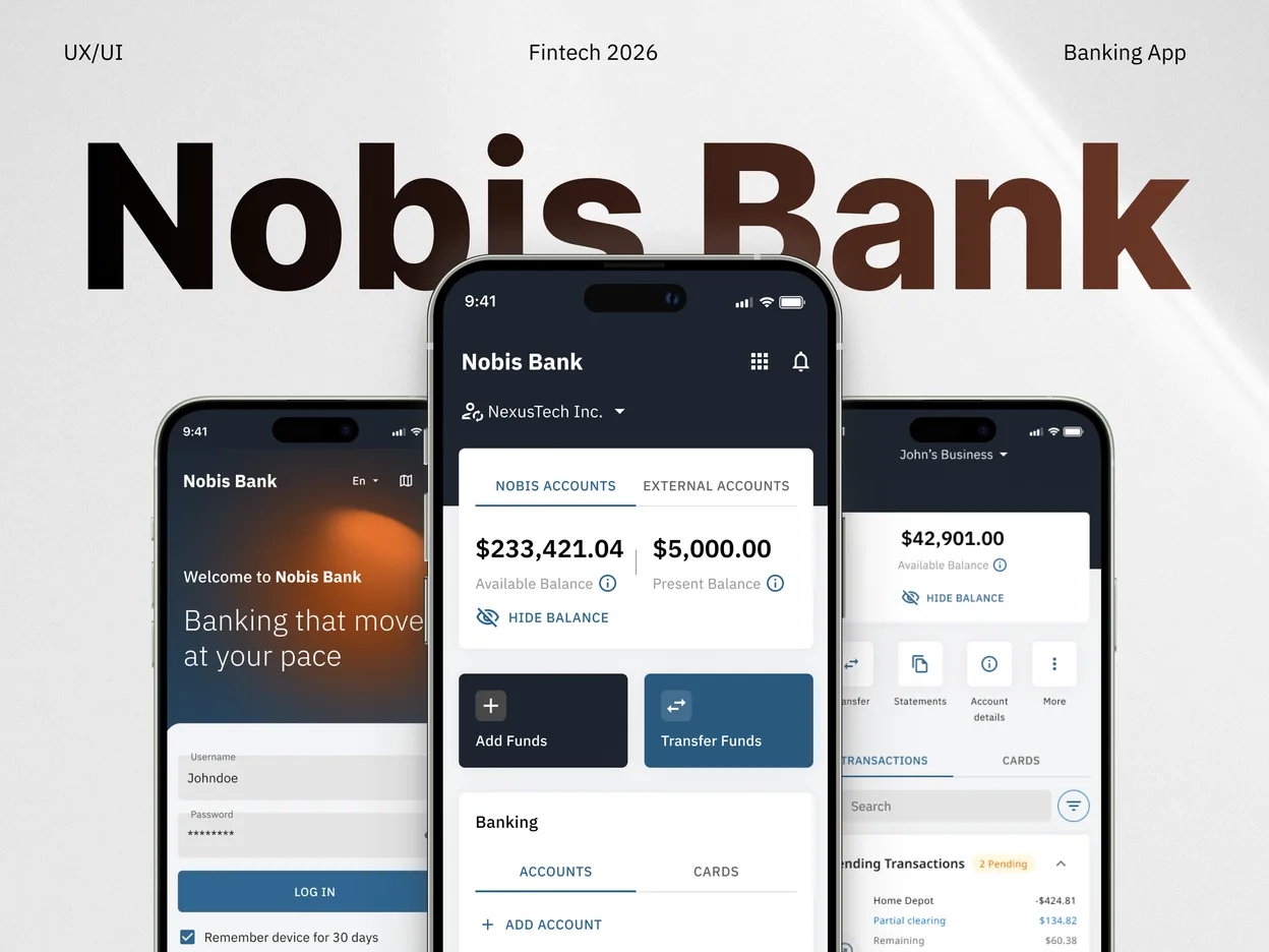
Nobis Bank login, home and account screens on three phones

OVERVIEW

A banking app for business owners: quick operations on the go, deeper analytics on desktop.

Accounts, cards, transfers, cashback and security, designed to stay simple as the feature set grows.

My role

I handled research, user flows, UI design and developer handoff. I joined as the first and only designer, built the product from scratch and led the first version to launch. As the product grew, I stayed on as lead designer and occasionally worked with an art director and junior designers.

WORKING PROCESS

A full product cycle, from first research to developer handoff.

  1. 01Upfront Research
  2. 02Flows & Data Mapping
  3. 03Validation & Testing
  4. 04User Insights
  5. 05Interaction & Visual Design
  6. 06Implementation & Handoff

PERSONAS

Three people use the same app for very different reasons.

A persona is a short portrait of a typical user. I defined the product's key user types to understand each one's main pains and needs, and built the solution around that data, not around assumptions.

Sofia Marin, Business owner

Runs a five-person coffee shop and is also its finance department.

Goals

Run accounts, payroll and payments from one app, with one live view of cash flow and the right access for each person.

Frustrations

Money comes in through one provider and goes out through three others, so every answer means stitching exports together by hand.

Marco Silva, Shift supervisor

Opens and closes the shop, runs inventory and orders stock. He spends on a company card within limits Sofia sets.

Goals

Order supplies and restock without waiting for approval, and see what the shop spends against budget in real time.

Frustrations

Purchasing stalls when Sofia is off-site, and stock spend is scattered across receipts, messages and personal cards.

Diego Ramos, Barista

Works shifts behind the counter. His only reason to open the app is his own money: the wages that land on his card.

Goals

Get paid to a card that works from day one, and move or withdraw the money whenever he needs it.

Frustrations

The usual options are worse: forms to open a payroll account, handing his account number to his employer, or wages in cash.

INFORMATION ARCHITECTURE

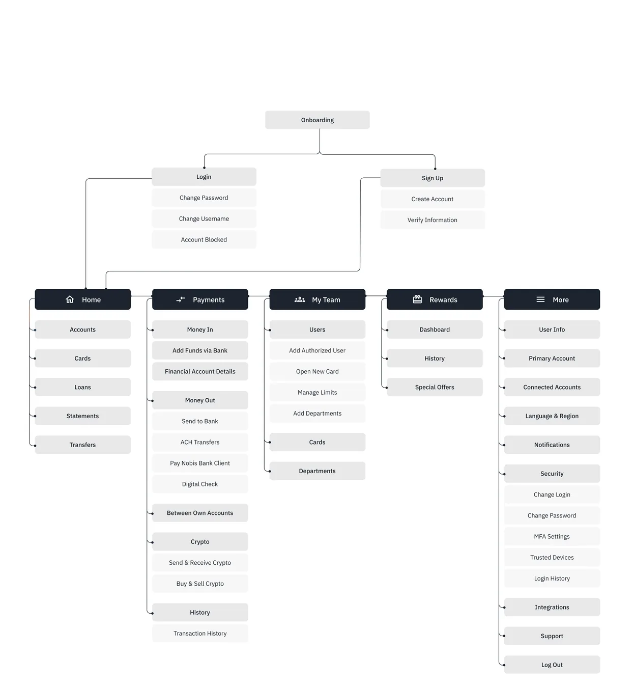
The whole app on one map before any screen was drawn.

The app's structure in one diagram: where everything lives and how users move through it. It exists so the product logic gets agreed on before the screens are designed. Redrawing a map is cheaper than redrawing mockups.

Information architecture of the Nobis Bank app: onboarding and five main sections with their screens

DESIGN SYSTEM

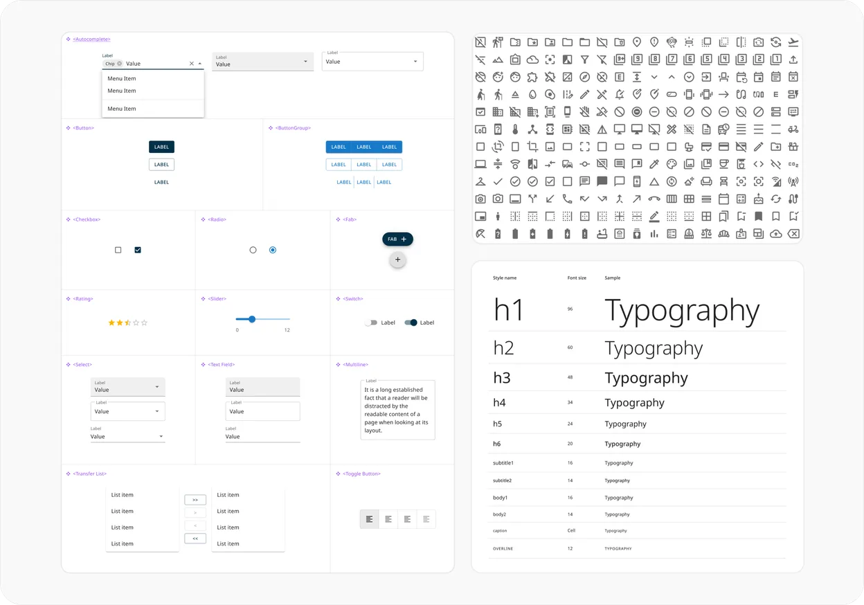
Material UI v5 as the foundation.

One library of components, icons and type styles across the whole product. A proven library was the right trade-off for this project's scale and budget: reliable quality without paying to reinvent the basics.

Material UI components, icon set and type scale used in the product

PROCESS & ITERATION

Key screens, and the problem each one had to solve.

Log in

UI concept

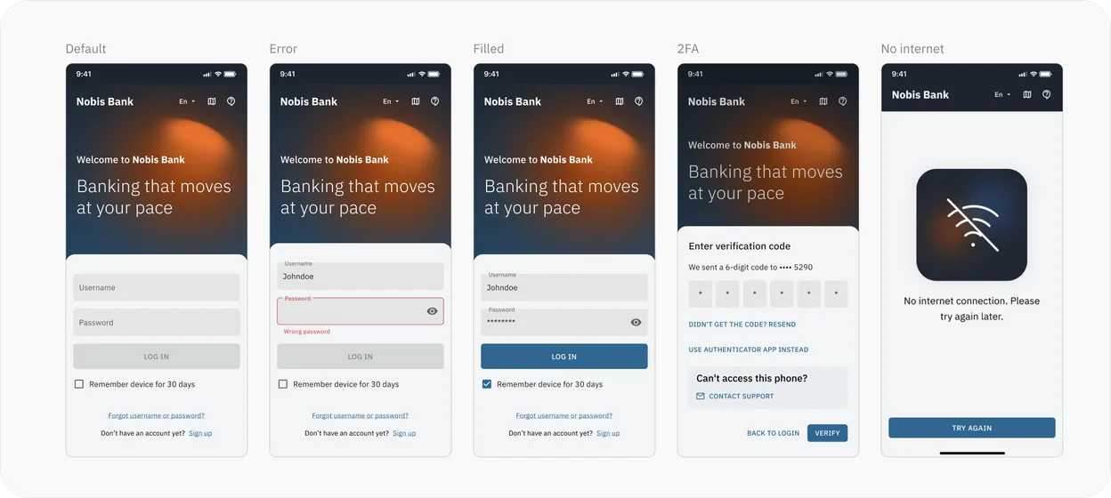
The interface runs on a low-saturation palette: a deep slate base, muted denim blue for structure and data, and a single warm orange held back for accents. Financial products earn trust by staying quiet, so colour never competes with the numbers. On login, a soft glow behind the headline recalls a desk lamp switched on in an early-morning or late-night office. Warm, familiar, and just bright enough to see by. It states the product's promise in one image: the app sheds light on money that usually sits in the dark.

Login screen in five states: default, error, filled, two-factor code and no internet

Home page

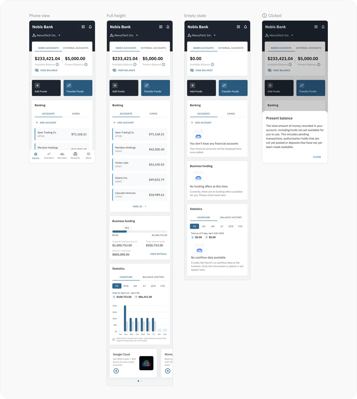
Challenge

The home page had to be the hub for everything the business does with money: every routine action one tap from opening the app. Balances across accounts, cash in and out over any period, transfers, and fast switching between the team accounts a user has access to. It also had to show money that has not arrived yet. A pending payment can look like cash that is ready to use, and treating it that way leaves the business short.

Home page in four states: phone view, full height, empty state and the present balance explained

Account

Challenge

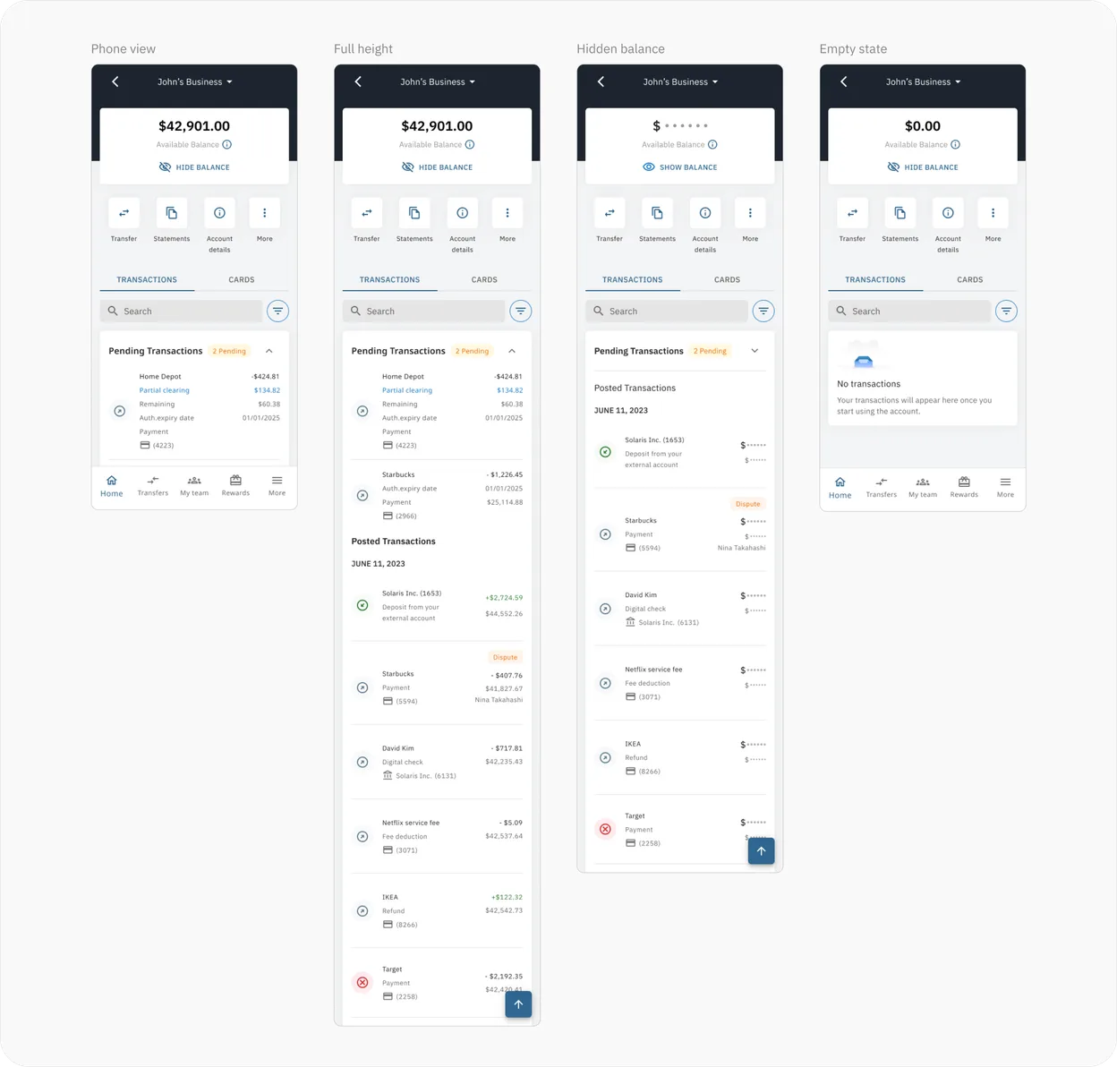
The account page had to stay simple while holding everything a user opens it for: the transaction history and the cards linked to the account, each with its key details. It also had to explain every dollar that is not where the user expects it. Remaining balances, pending payments and holds sit next to the amount they affect, so the gap between what came in and what can be spent is never a guess.

Account page in four states: phone view, full height, hidden balance and empty state

Web version

Challenge

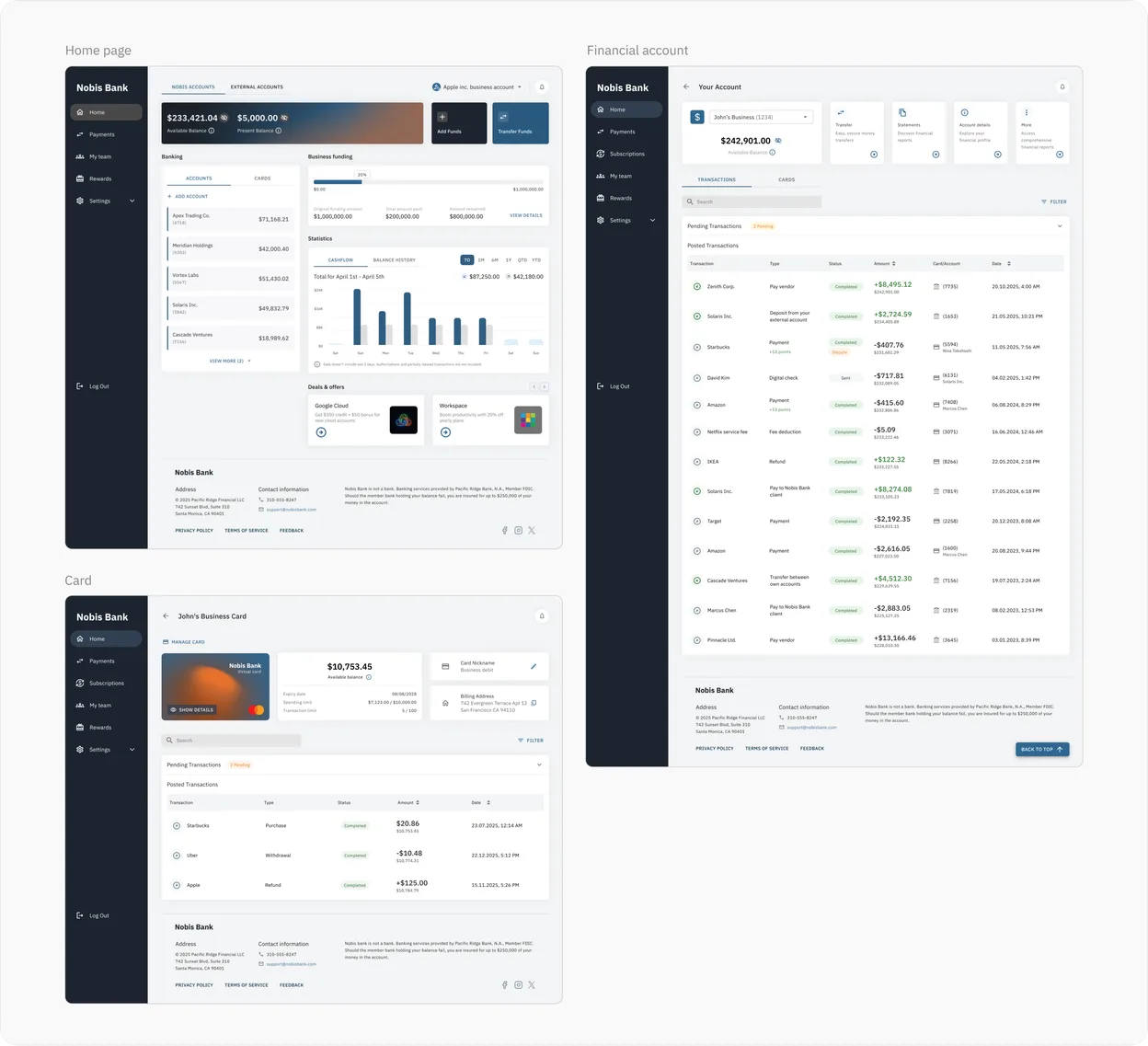
The web version is as important as the app for our users. Every mobile function is here, plus the work a phone makes awkward: batch reports and anything that has to be read across rows and columns at once. It is opened by owners and managers rather than staff mid-shift, so the priority shifts from speed to completeness: a full, current picture of the numbers and of how money is moving.

Web version: home page, financial account page and card page

Dark version

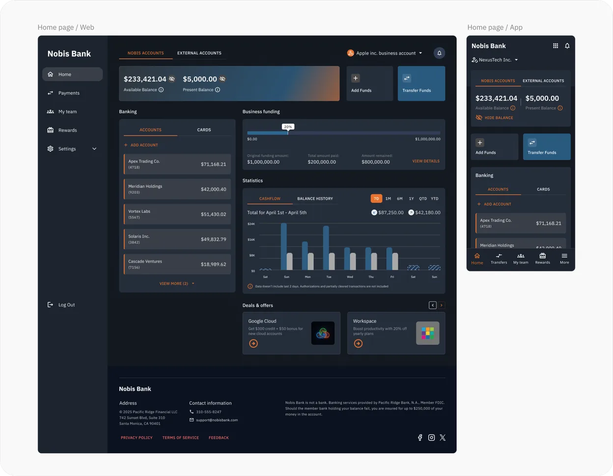
The same interface in a dark theme.

Home page in the dark theme, on the web and in the app

ENGAGEMENT & GROWTH

Partner offers that users actually notice and use.

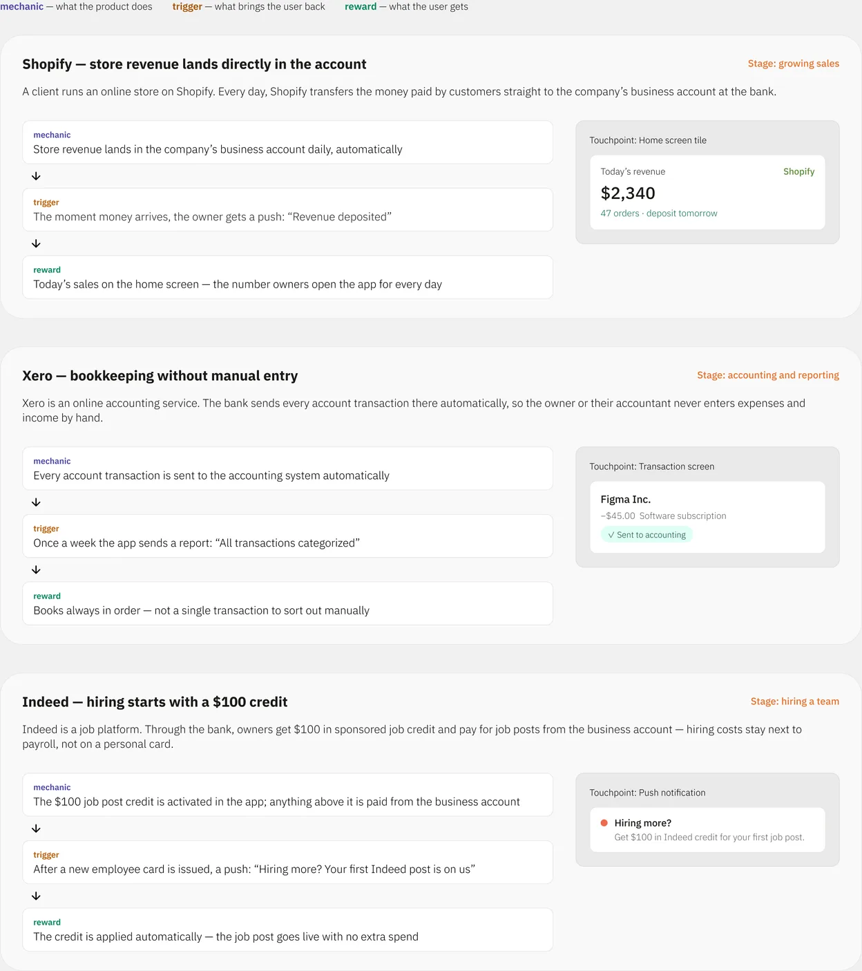
I was tasked with taking the bank's existing partners and their offers and turning them into something users would actually notice and use. I designed the offer display mechanics, where and at which moment of the flow each offer surfaces, and the flow for claiming it, so owners see their benefit at a glance and have a reason to open the app more often.

Three partner offer mechanics, Shopify, Xero and Indeed, each with its trigger, reward and the screen where it appears

Visual example

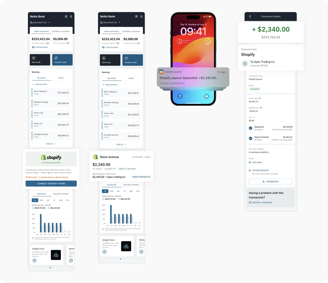
A walkthrough of how one of the partner offers is implemented in the interface, from the moment it surfaces in the user's flow to the moment it's claimed.

Shopify payout offer in the app: home page, push notification and transaction details

TOOLS

Figma, Claude

This case is a redesigned and renamed version of a real product I worked on, which I can't publish under NDA. The logo and name are fictional; the business strategy, data and UI have been changed.