CASE STUDY
Agroros Bank
A redesign concept for the website of Agroros, a bank in Saint Petersburg. A study project at Moscow Digital Academy.
- Website
- Banking
- Redesign
- Study project
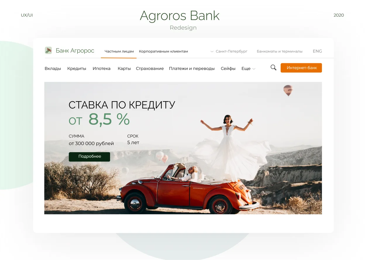
OVERVIEW
Make a bank website lighter, clearer and more modern.
Task
A redesign of the Agroros Bank website: making it lighter, more intuitive, fresh and modern.
Solution
To make the website feel lighter, I built it on white combined with airy blue and grey. Orange and dark green elements set the accents, backed by bright images, so the information is easier to take in visually and emotionally. I also refreshed the bank's logo to make it more modern and in tune with the new website. A mind map helped arrange the information blocks in a more logical order that is intuitive for visitors.
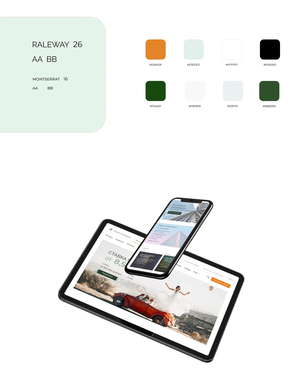
COLORS & FONTS
White as the base, with airy blue and grey. Orange and dark green for accents.
MIND MAP
The whole website mapped out before designing the pages.

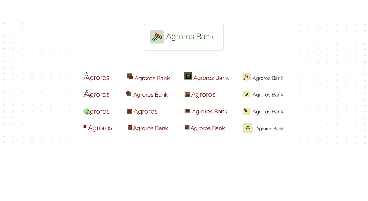
LOGO
A refreshed logo that fits the new website.
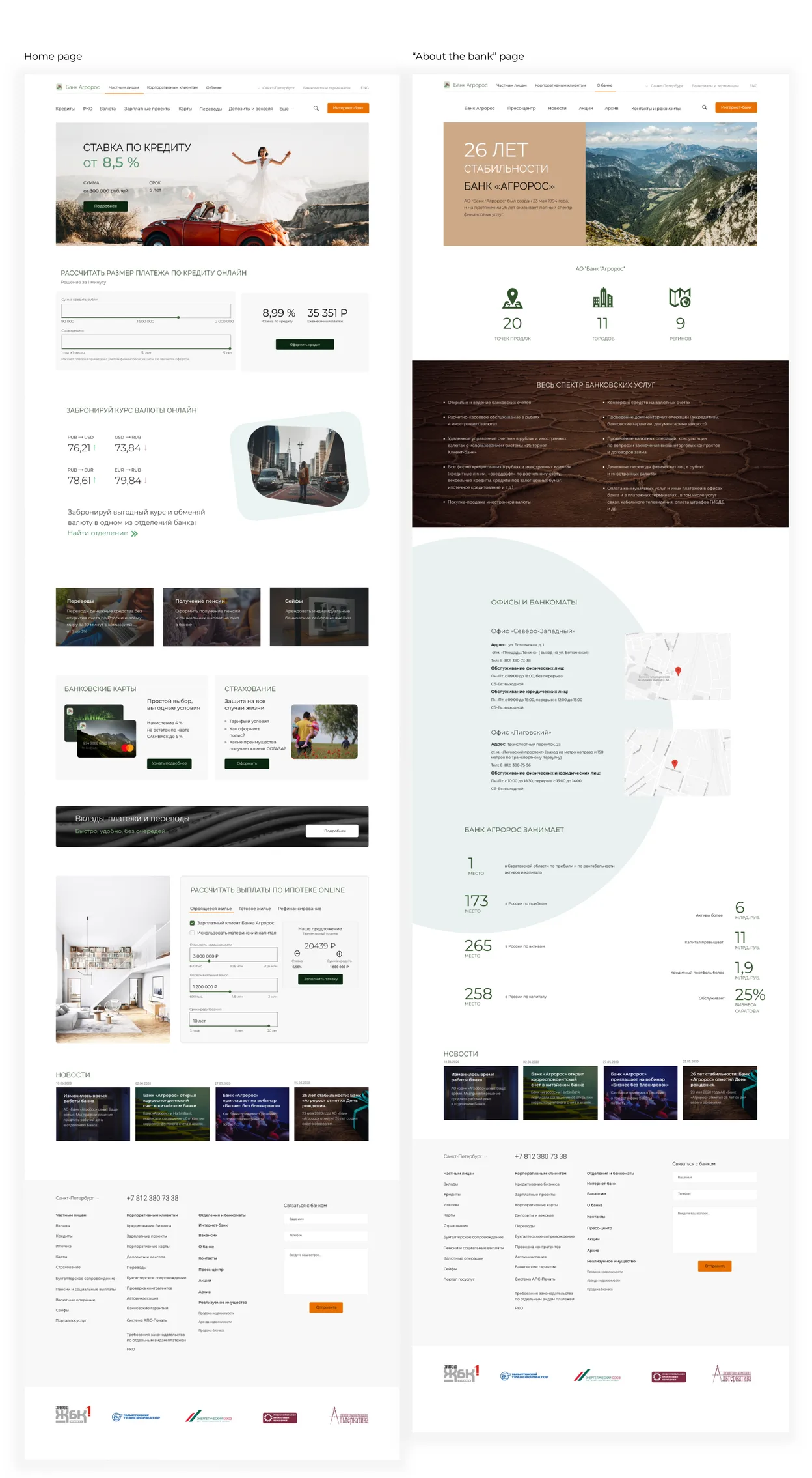
WEBSITE PAGES
Key pages of the new website.

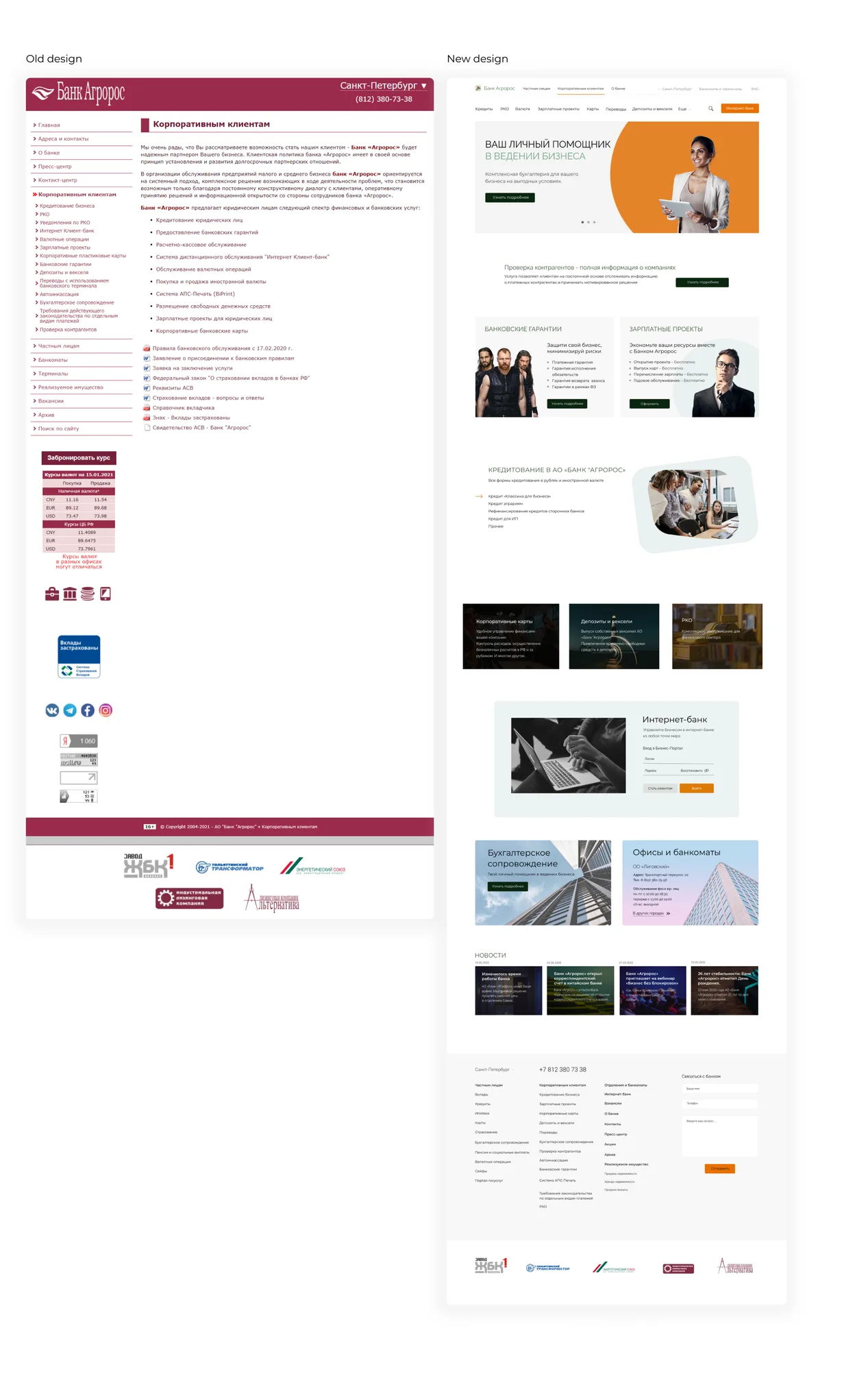
OLD & NEW DESIGN
Before and after, side by side.
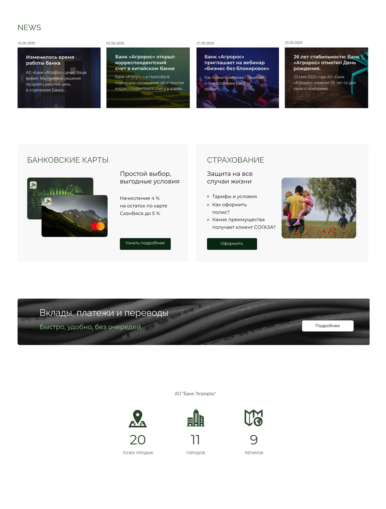
ELEMENTS
News, product cards, banners and key figures.
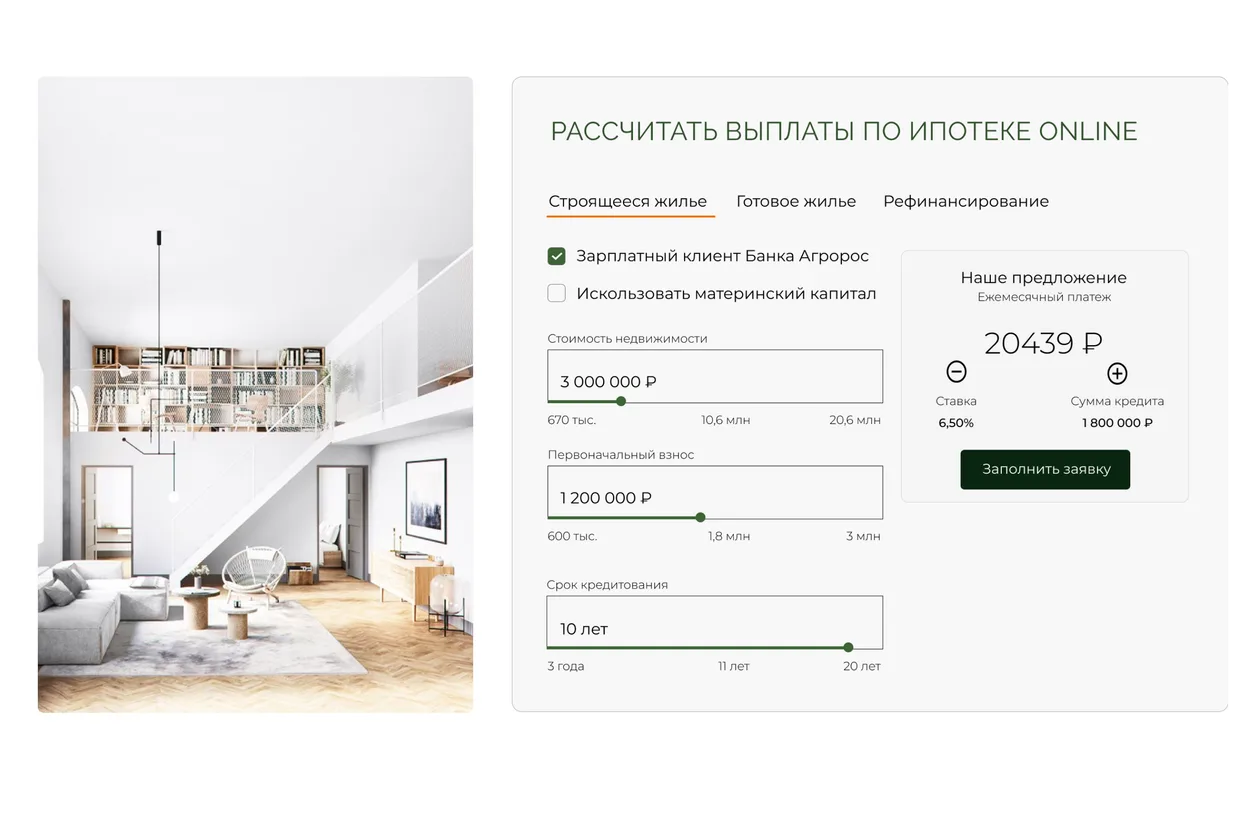
ONLINE MORTGAGE CALCULATOR
A calculator to estimate a mortgage online.
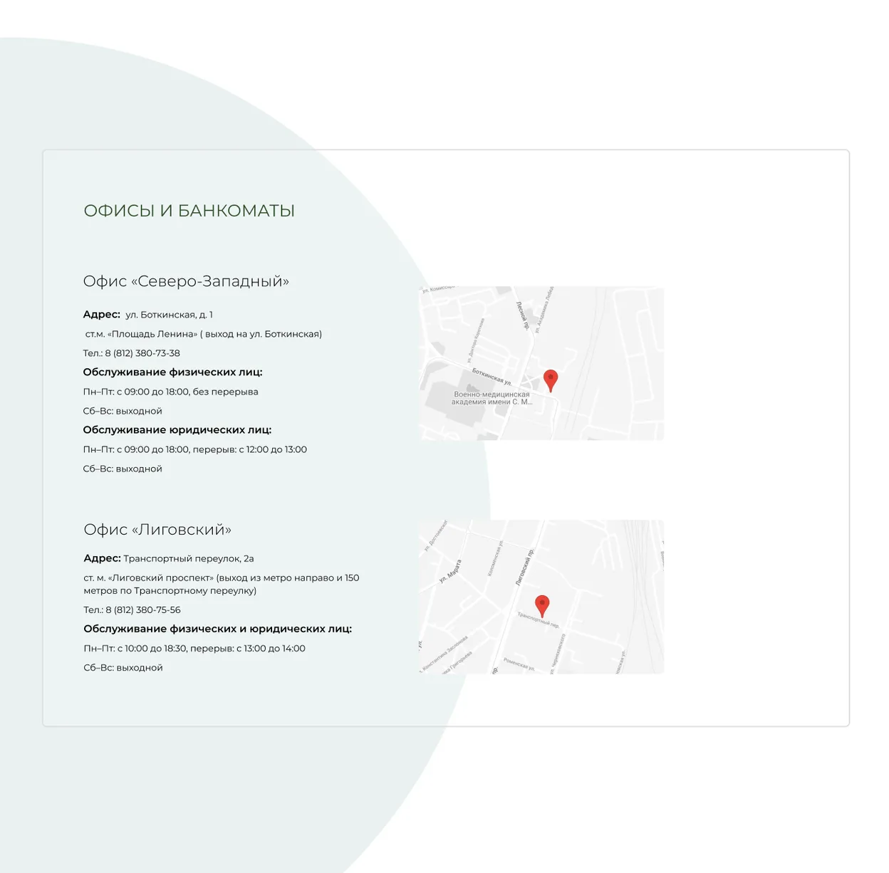
CONTACTS SECTION
Offices and ATMs, with addresses, maps and opening hours.
ABOUT THIS PROJECT
All photos, fonts and other materials were used for non-commercial purposes, as part of a training programme at Moscow Digital Academy. The website screens show the original Russian-language content.